Gategroup
Gategroup, which delivers training to students 39,000 ft. in the air, needed to improve the effectiveness of its courses.

Project Goals
To streamline and improve the quality of courses provided by Gate Retail Onboard (GRO), a member of Gategroup. GRO had been conducting onsite training for its employees, but this proved to be a costly and inefficient endeavor. To help, my team and I set out to create an effective, easily accessible mobile learning environment.
Courses
Learners
Airlines
Project Strategy
By utilizing our in-house LMS (learning management system), my team and I would design a mobile learning environment with courseware that could hook into our API. We also needed to build an LRS (learner record store) that was SCORM compliant and could surface learner results to a dashboard that would track the progress and effectiveness of the training.
Strategy
Business Workshop
Brand Partnership
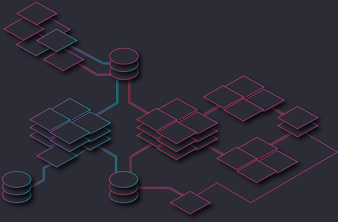
Technical Architecture
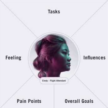
Experience
Journey Maps
Empathy Maps
Proto-personas
Task Analysis
Design
Style Guide
Mobile Courseware
Desktop LMS
“I have great relationships with the learners, but I need a way to teach and inspire them that doesn’t require me to physically be there.”Baden Frosen
A remark that made me realize this product needed a soul.

Data
Collection
Baden Frösén, my client at Gategroup, had just one week with my team in Orlando — so we needed to maximize our time with him. All the project leads came together prior to his arrival to discuss the aspects of the project we needed clarity on. We created a five-day agenda that allowed each of us to focus on specific aspects of the project. The design team was focused on collecting logos, guidelines, photos, fonts, and illustrations from the Gategroup brand team. We also collected user demographics and analytics from the BI team. On the last day we set KPIs and made sure everyone was aligned on the business needs and limitations.
User
Research
Fortunately, we had a lot of great data about the learners based on employee documents and survey data from the in-person courses. We synthesized this data into proto-personas and validated them through learner interviews. Once we felt confident in the findings, we created four empathy maps to reference when developing journey maps and ideating on the interface.
Technical
Structure
Understanding the technical structure was important for us. This information would help us better understand the business rules around SCORM compliance as well as understand the data points we could surface through xAPI. We used this information as reference when creating journey maps and sketching UIs.
Gategroup
Branding
Gategroup had a mature brand guide that was great for branding, print, and course assets, but they had nothing for UI and digital guidelines. Our first step was to work with their brand team and extend the brand guide to an interface style guide. Below are some of the assets we used as a foundation for the UI style guide.
Brandmark

Brand Colors


Color
Grading
We started with expanding the color ranges using the step blend option in Illustrator. We set a high and low tint, then step blended the colors to get a balanced set of light and dark options to choose from. We presented multiple options and landed on the options below.

New Colors


Gradients


Utility Colors


Typography
Choices
We knew the product would exist as a web app and as a native app on Android and iOS products. Apple products use the font San Francisco and Android uses Roboto. Both fonts are neoclassical, so we wanted something similar for the web. We landed on Univers, a neoclassical font with over 20 weights that was adaptable to all our needs.


Mapping the
Typography
After deciding on our font stack, we started mapping them to our components. We created 12 type variables and mapped the styles to the different devices and breakpoints we supported. We defined type sizes, line heights, and kerning for each variable in each device. Then, we created tokens to apply to our components.

Atoms &
Molecules
While focused on our research we also started work on the design system. We took an atomic approach by building up a set of atoms and molecules that would serve as a foundation on which to build our components and templates. While looking at our data structure we could set rules around how to visualize information contextually, with device awareness in mind.
Input Fields


Input field active

Input field Error

CTAs

Primary CTA

Video CTA

Secondary CTA with icon
Icon CTA
Sketching
the Courseware
As we conducted our research we also started conceptualizing feature flows and the overall design. We began with the learner app experience and worked back to the course development tools. Features were tested at every step of the design process, from sketching with learners to conducting full interactive task-based analysis.


User
Flows
As our hypotheses were being proven through user testing, we starting looking at the design on a macro level. We developed user flows for how a learner would move through the product feature by feature. This helped us define contextual animations and opportunities for delight.

Injecting
Personality
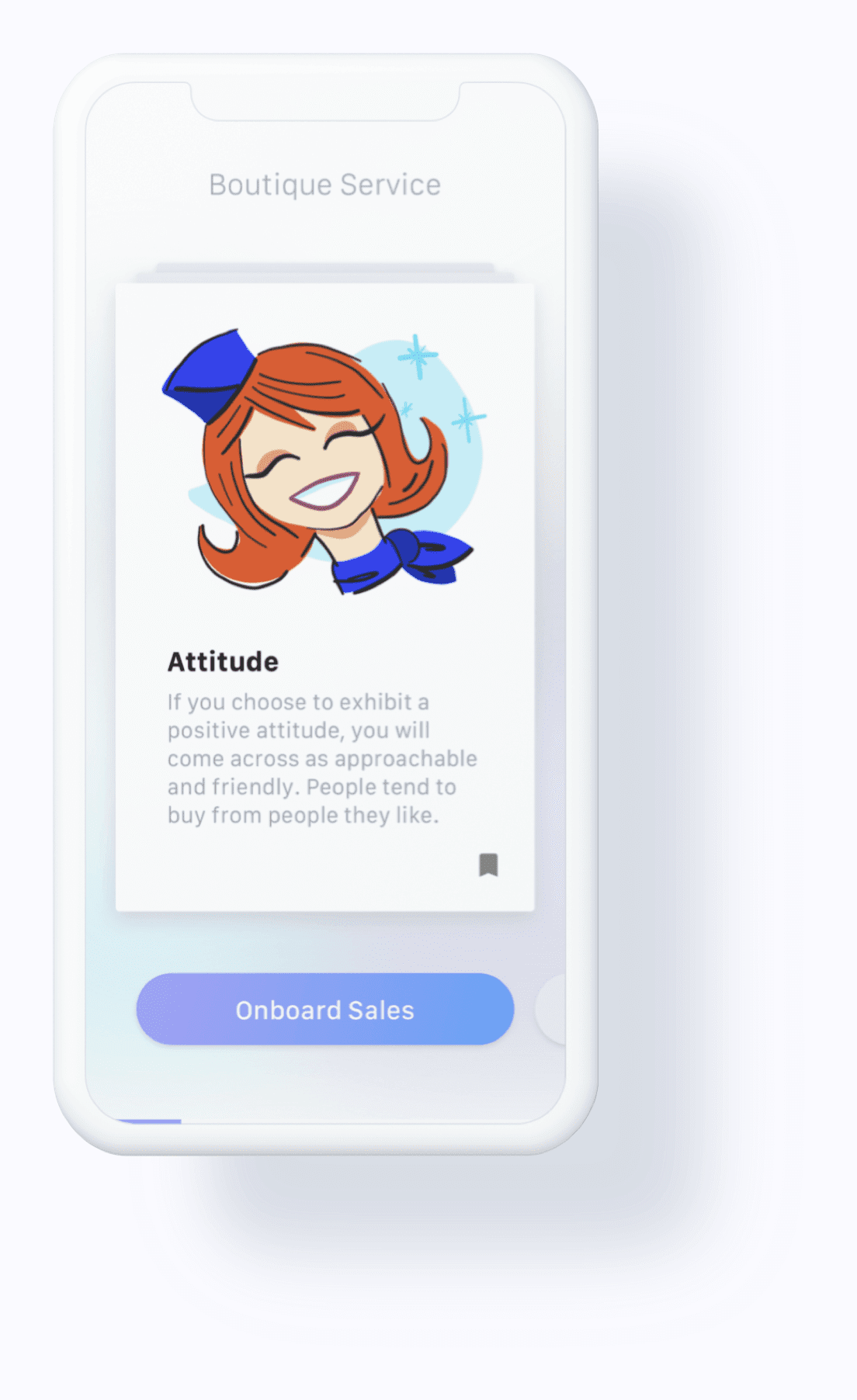
Beyond adding delight, illustrations help visual learners retain information. We knew we needed something fun and bright that we could build at scale. There would be a lot of spot illustrations needed in the courses and we would need non-artistic designers to help generate them. We created a simple framework of basic rules and colors as well as Pinterest boards for inspiration. After some quick training, the designers sat with content creators to devise illustrations that paired well with the course content. All illustrations passed through me for art direction and consistency.


Engaging
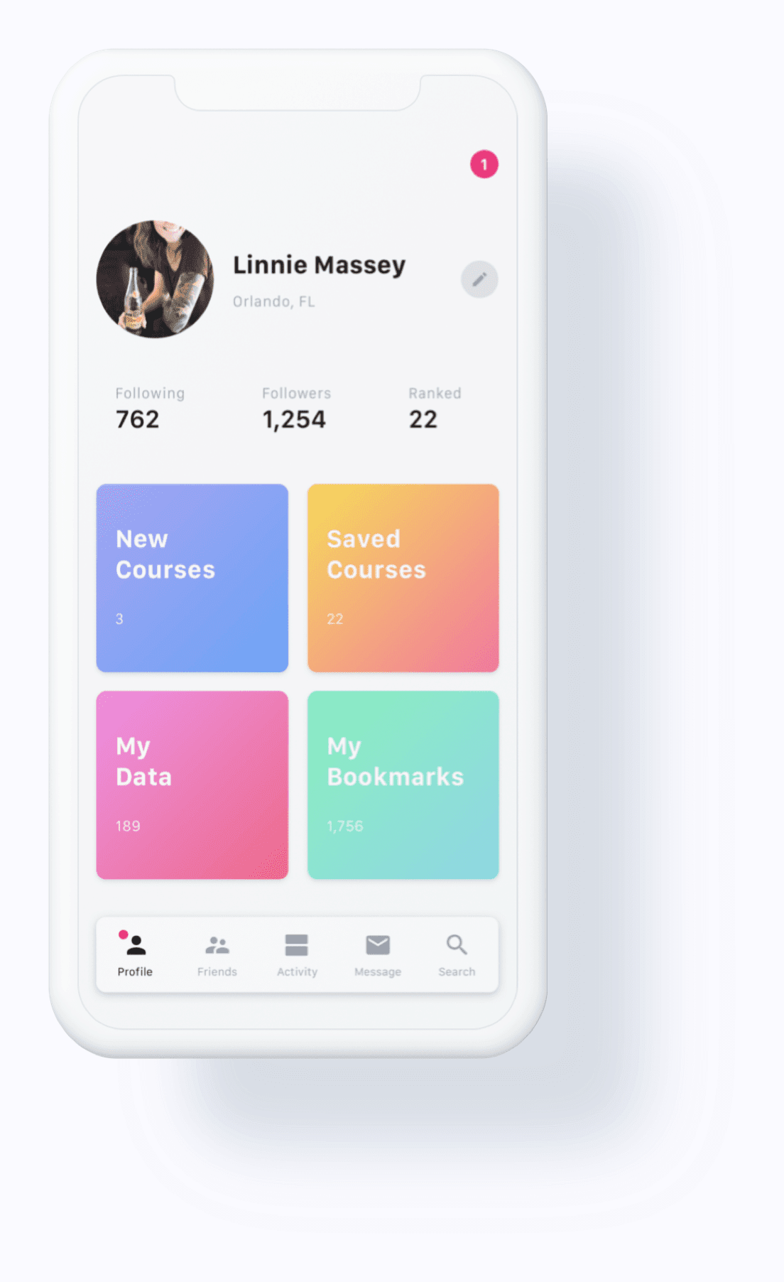
With Content
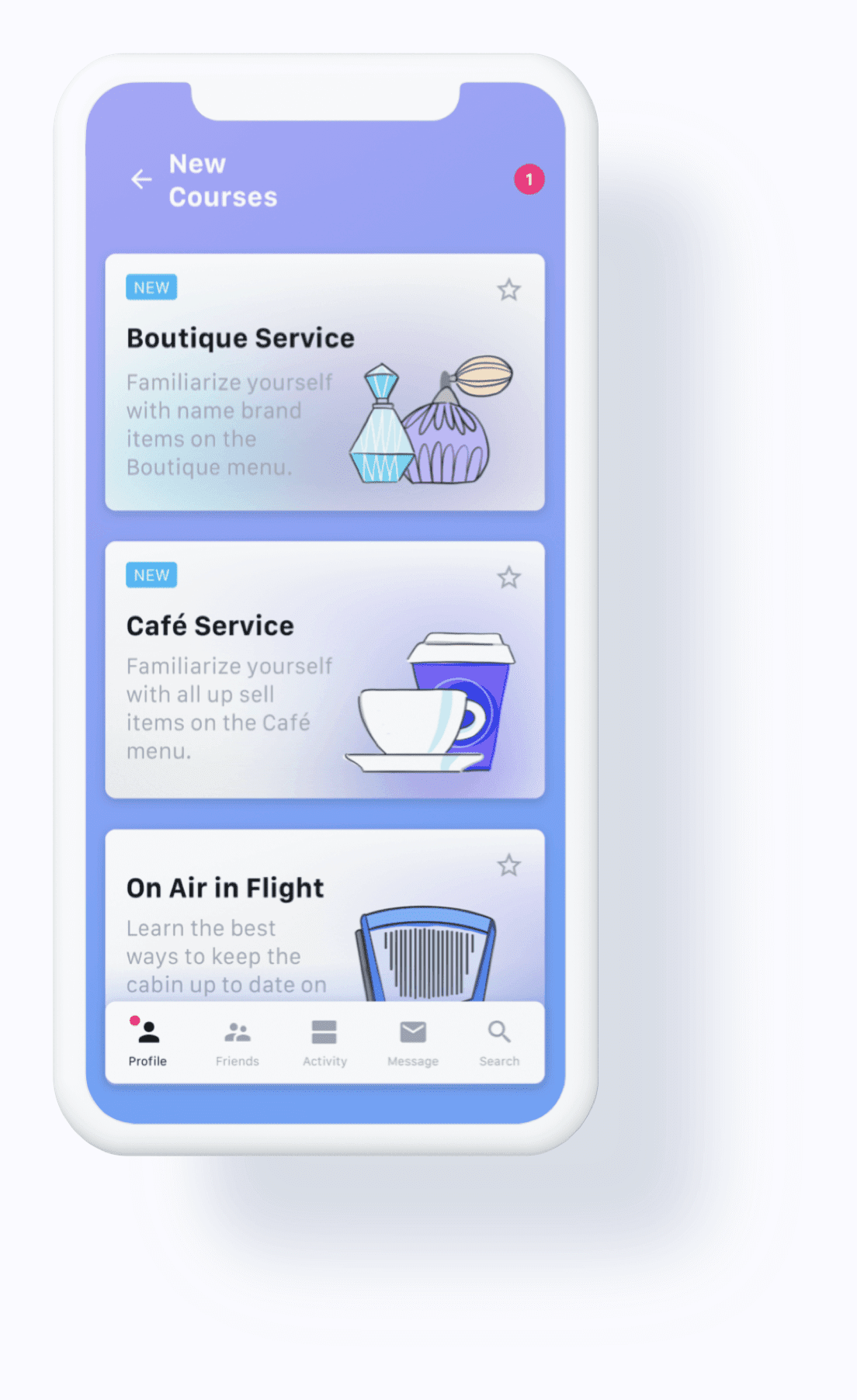
The learner dashboard was designed to be purposeful and actionable. Because the app is an educational tool, we needed to make sure learners clearly understand how to find new courses and start taking them within moments of opening the app.
Data
Collection
Data is an important and complex tool that drives learner engagement, and it is accessible and contextual throughout the app. It is used to answer questions for the learner and provide feedback for course creators.
Flash
Cards
Course creators broke content down into smaller, digestible bites that were paired with illustrations. This format keeps the user concentrated on the lesson and reduces fluff in the content. Learners receive a max of 10 cards and are then tested on their ability to retain the information. If a flash card has a piece of info the learner feels is important, they can save the card to their profile.
Thought-Provoking
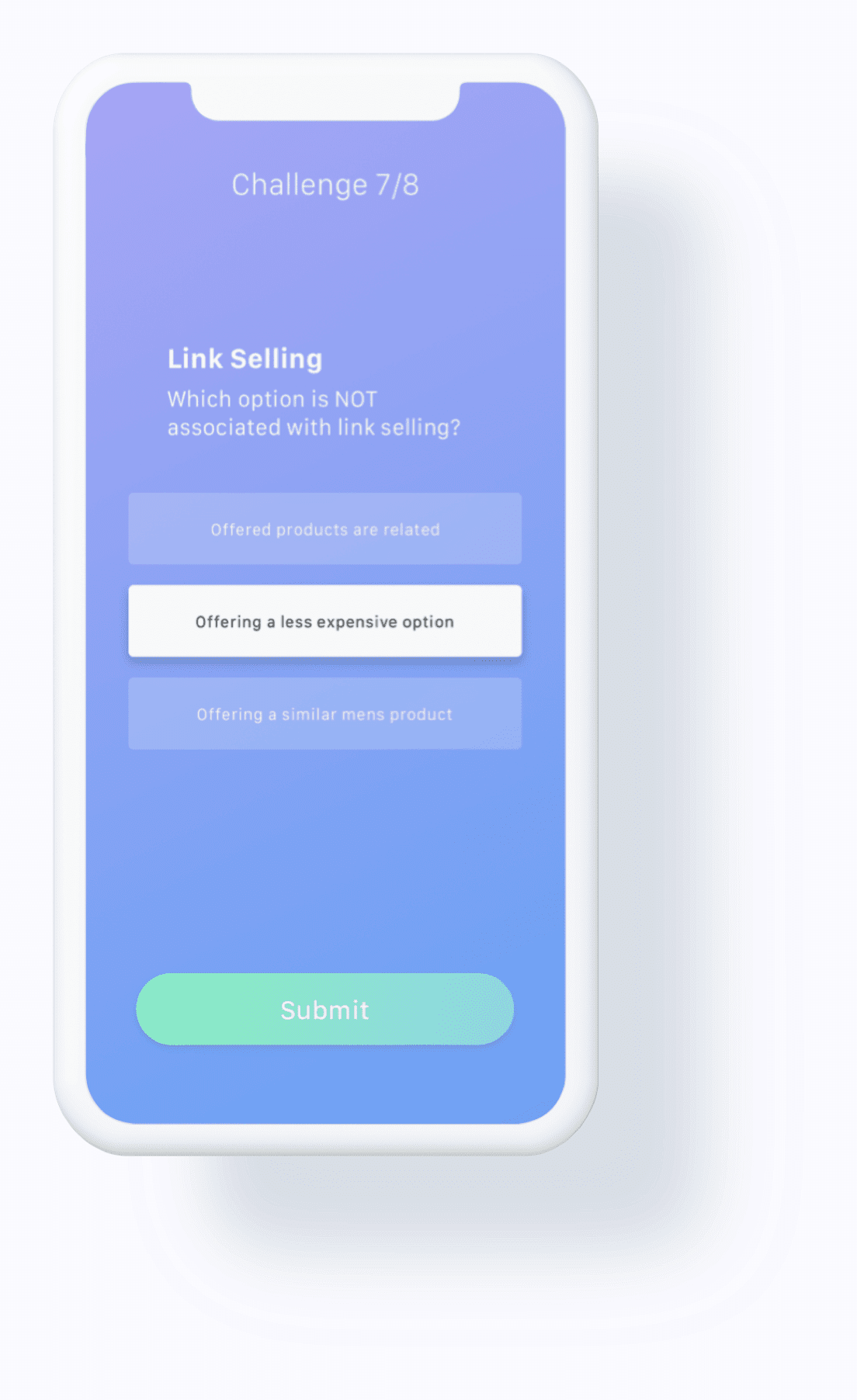
Challenges
Challenges were painstakingly designed. We wanted to create interesting, attention-grabbing interactions that were easy for learners to use. In the challenges, feedback is withheld until learners complete all challenges; this prevents them from getting discouraged if they are struggling. Animation is used to give the learner a clear understanding of the fast-paced transitions between course content and challenges throughout the lesson.
The Learner
Management Tool
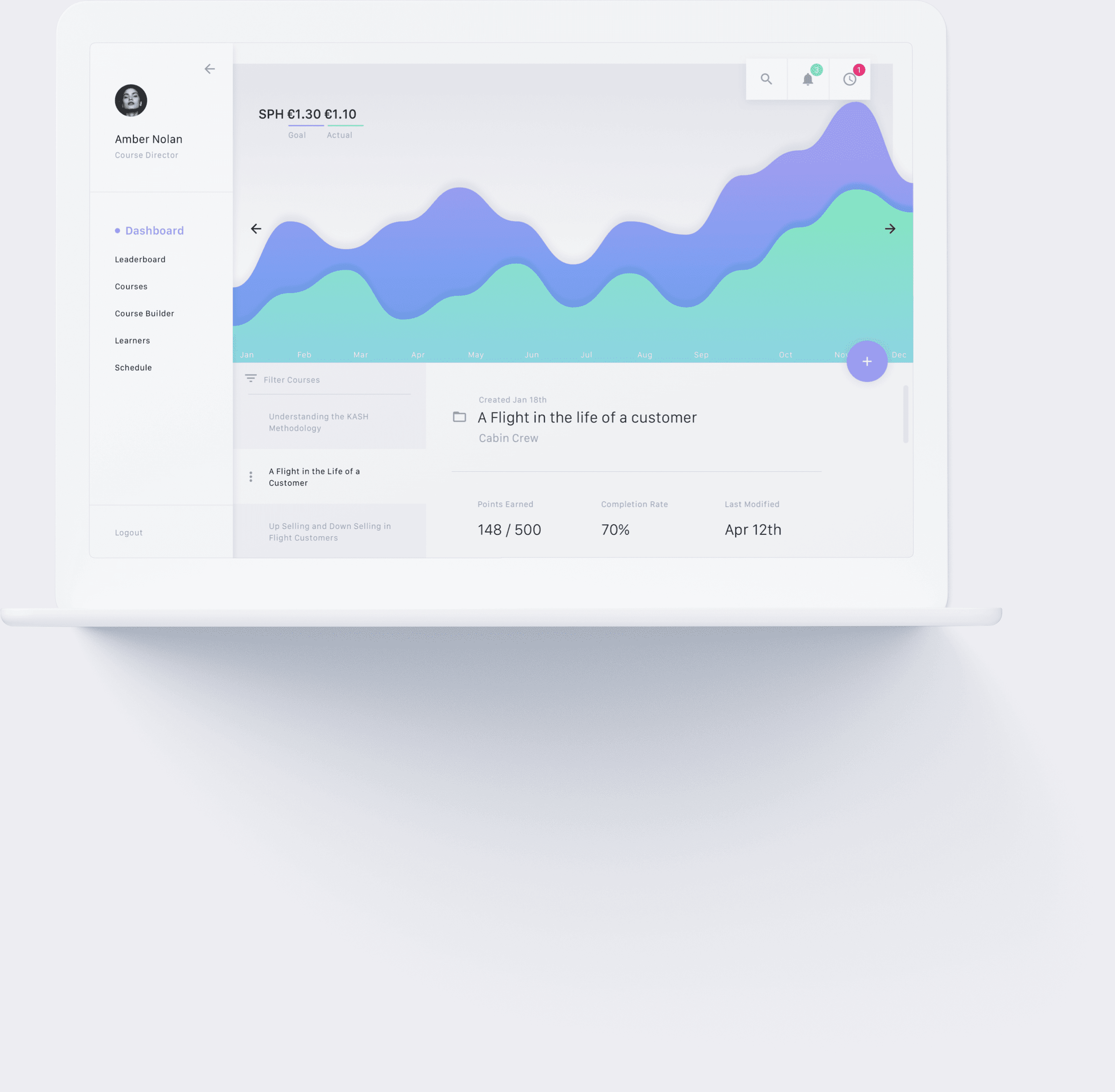
Since Baden wouldn’t be training on location, he needed a tool that allowing him to create content and track its effectiveness remotely. Below is the scheduling view that displays when a course is released, what its window for completion is, how many learners have completed the course, and how well they are doing.

A Snapshot of
Courses in Flight
The dashboard is used to get a high-level view of courses learners are taking and see how well they are doing. The course director can get feedback on the course from the learners and reach out to them if they are struggling. This allows the courses to retain that hands-on feel at scale.
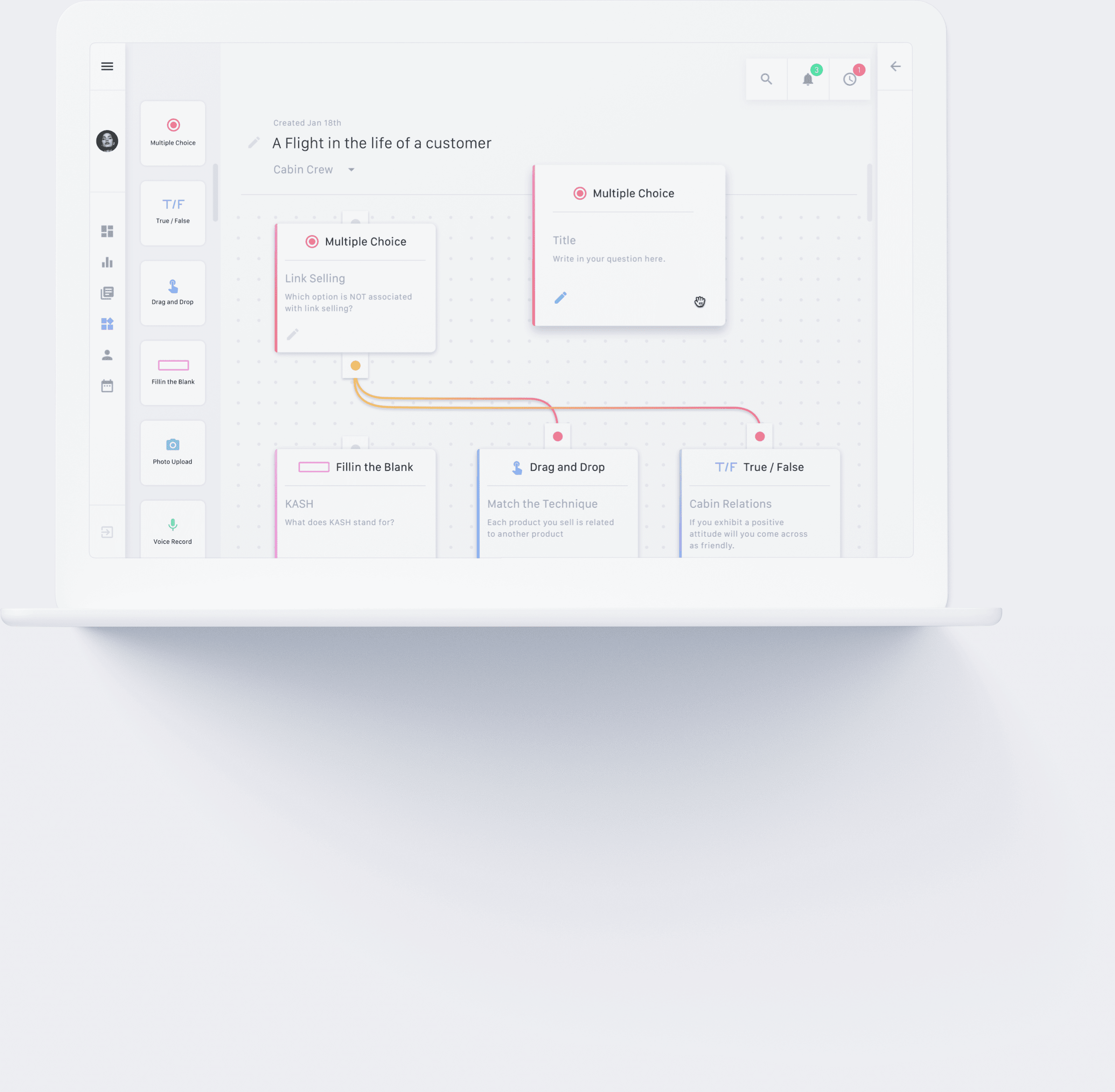
Course
Creation
Course creation is a critical part of the system. We created a drag-and-drop interface allowing course creators to outline the course into chapters. Each chapter has a lesson consisting of flash cards and an interactive challenge section. Challenge types can be mixed and matched and routed to allow for SCORM compliance and to prevent learners from memorizing answers.
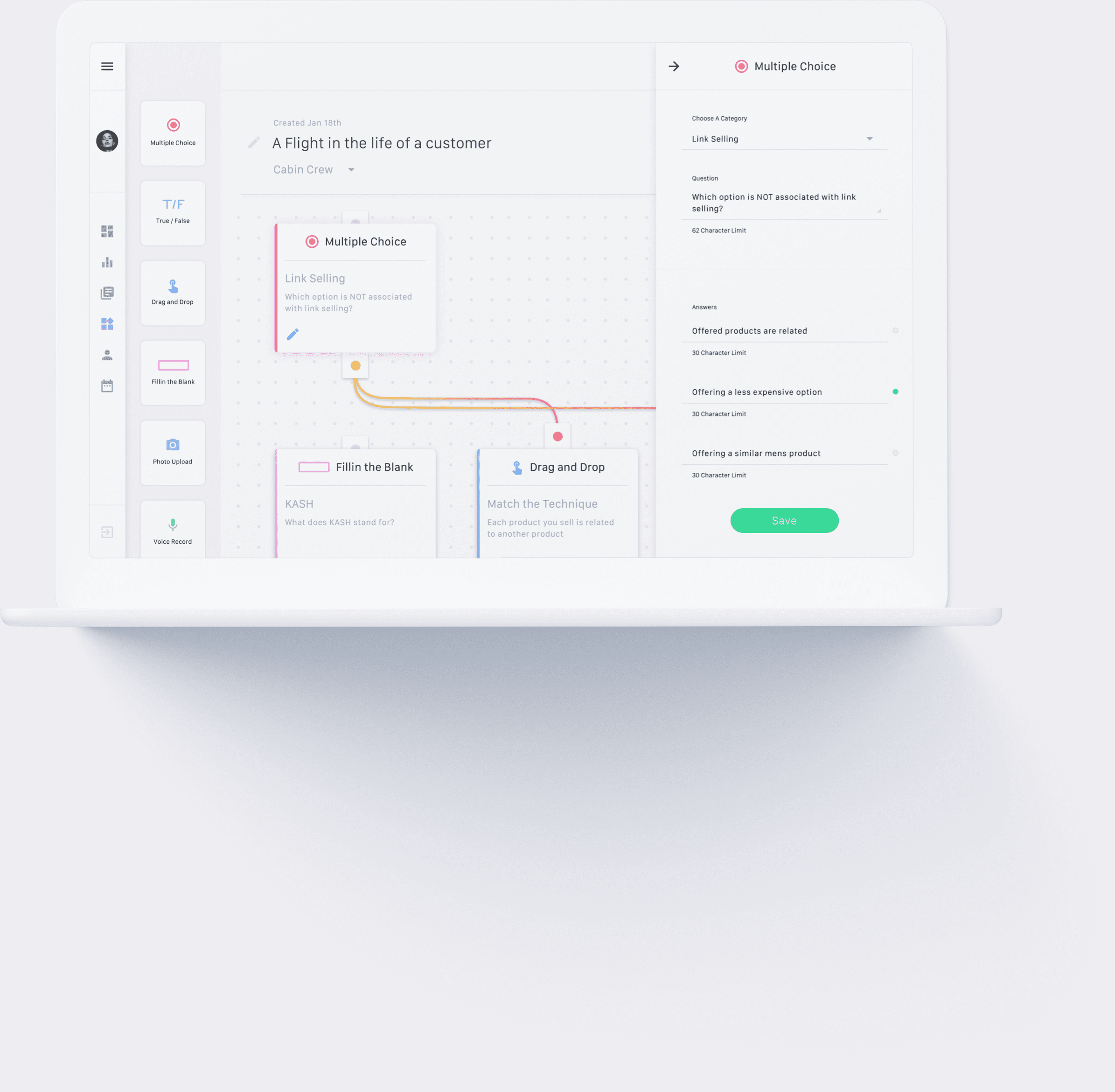
Editing
Modules
Working with challenge modules can quickly become complex. We decided to allow course creators to lay out and route the challenge flow in the main area of the view that we called the grid. When the edit icon is pressed, a drawer opens in the right side of the view where categories, questions, and possible answers can be added.
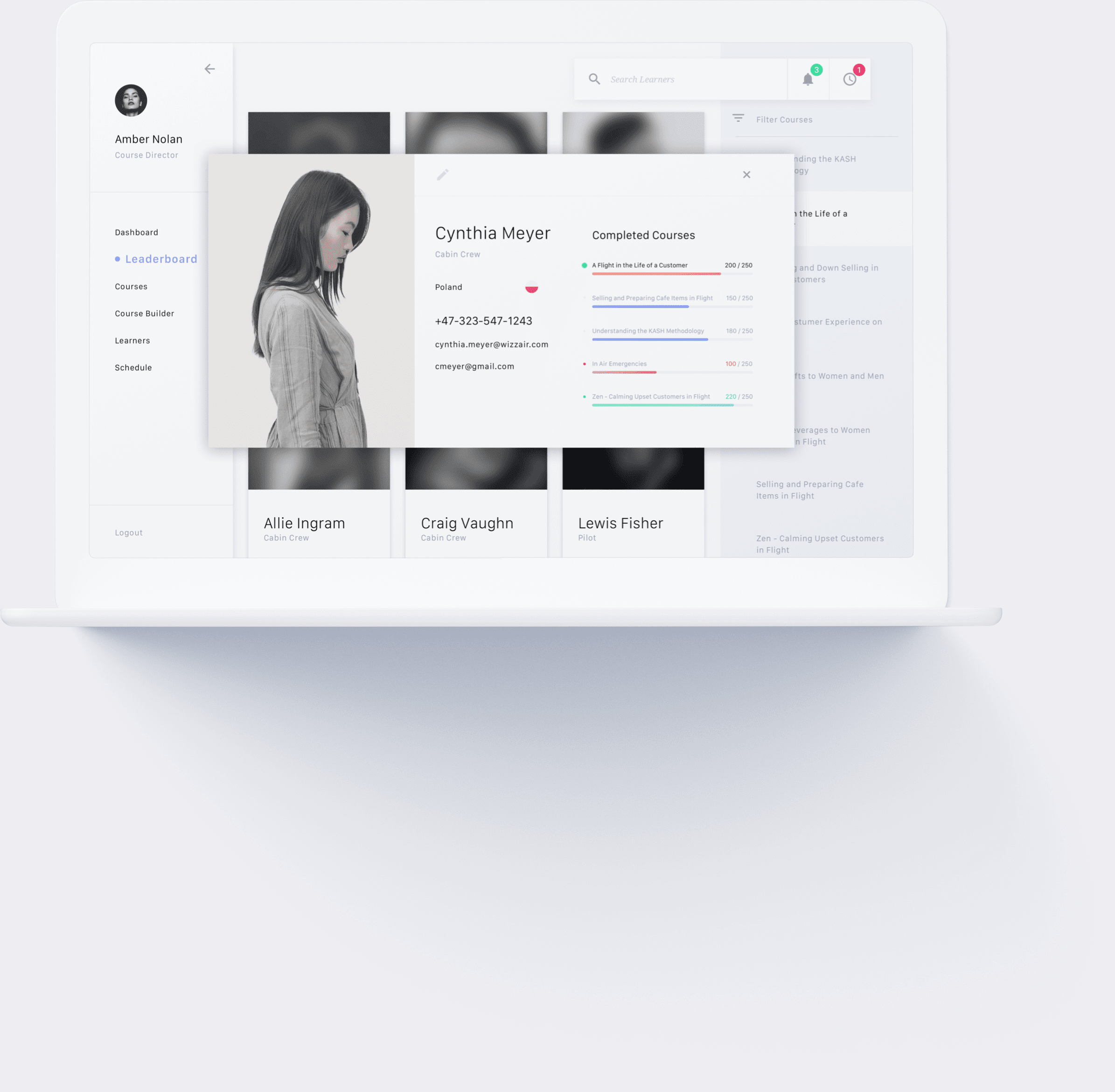
Learners
in Focus
After speaking with Baden and the students, we knew the personal aspect of the training was important to everyone — so creating a remote system was a concern for us. However, by using data and rich learner profiles, we were able to give Baden and course creators the ability to be alerted when a learner is struggling or excelling so they can reach out and offer help or praise. This serves to keep learners engaged and gives them the sense that the training matters and someone cares about their progress.
Final
Thoughts
In retrospect, I’m very proud of the work we did for Gategroup. I think spending time talking with the learners and ensuring we were creating something useful for them was critical to our success. I also think that sketching, prototyping, and testing the platform’s many complex interactions allowed us to take something that could have been daunting and instead make it simple and intuitive.