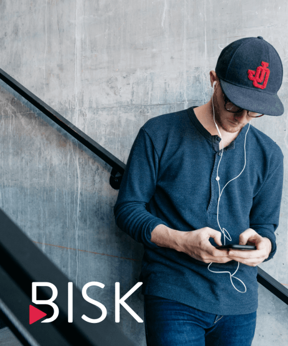
Bisk
With 45+ years of experience in the education space, Bisk was looking for a brand reboot to better express its values.
Project Goals
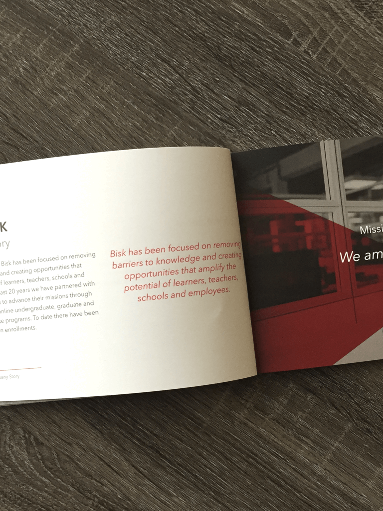
To re-establish the Bisk brand. Despite Bisk’s success over nearly half a century, the company had begun to lose sight of the principles it was founded on. In losing focus of its primary goal — to improve the learning experience — Bisk was falling behind its competitors in key operational areas.
Courses Developed
Enrollments
Faculty Supported
Project Strategy
Bisk needed to build on the momentum derived from the company’s cultural shift and establish a clear and unified organizational mission. This mission would revolve around the purpose of the Bisk brand. In defining a clear purpose, we could succeed in placing Bisk back at the center of the learning experience.
Research
Personas
Competitive Assessment
Core Values & Mission
Design
Brandmark
Color Palette
Typography
Photography
Tone of Voice
Development
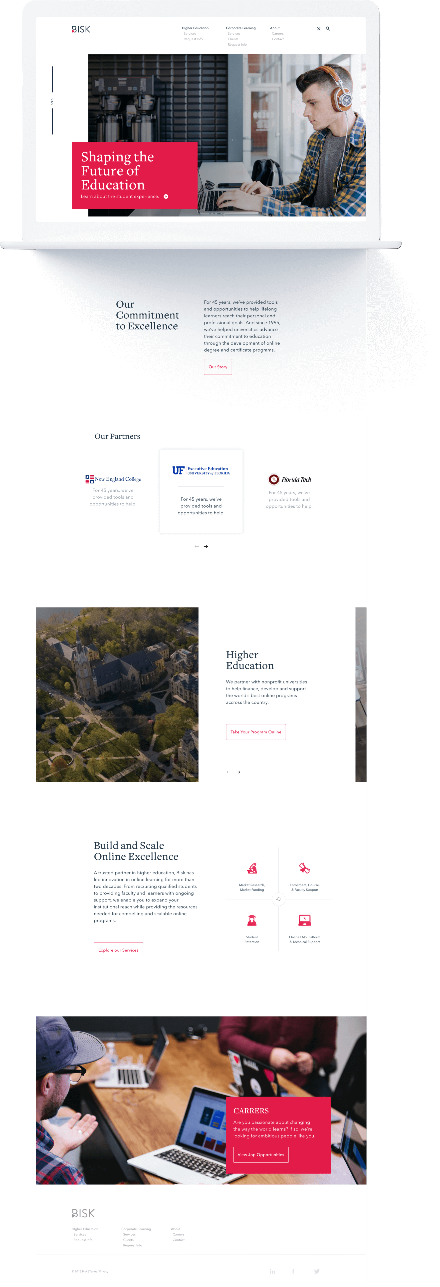
Marketing Site
Asset Management
Internal Reveal
“I like the one on the right. It makes me want to reach out and press it.”Nathan Bisk
The statement that landed the final decision on the brand mark.

What is
Brand?
To me, brand is about understanding how your audience sees you and how you want to be perceived. Communicating a clear perception of a company starts with consistency. Everything, from the site and product packaging to customer service and even the office, needs to clearly communicate the company’s brand values. My goal with this project was to understand Bisk from the point of view of its customers as well as its stakeholders. In doing so, I found that these parties were unaligned. My job was to realign them.
Understanding
Our Audience
With access to 45+ years’ worth of enrollment data, my team and I had the fortune to dig through some great demographic information. We also gained insights from conducting our own user research on Bisk’s product and competitors’ products, which we paired with market projections from Bisk’s BI team and third-party research from Forrester. With this information, we were able to create our first round of data-driven personas and were one step closer to creating a user-centered culture.
Nick Jacobs
“I want to focus on my education but feel I never have enough time.”
| Age | 23 |
| Location | Lansing, Michigan |
| Job | Server |
| Salary | <20k |
| Status | Single, one child |
| Course | Sport Coaching & Leadership |
Goals
I want to feel like I’m getting the same education I would get if I were on campus. I want to feel connected to my classmates and comfortable reaching out to them if I need help.
Concerns
Between work and family, I don’t have a lot of time for school. When I sit down to focus on my classes I want to ensure the time spent is useful and impactful.
Environment
Nick* is a tech native and typically does class work from home in the living room and occasionally from work at a table in a quiet area of a restaurant.
Who Are We
Up Against?
Online education is a hundred-billion dollar industry. With students considering options across a vast landscape of providers, it’s hard to find a niche market fit. We knew with so many options available to students we would need to widen our research to everything from consumer-based platforms to industry-specific platforms. We conducted brand audits, SWOT analysis research, and student interviews to develop a deeper understanding of student needs and better understand of our niche market fit.

Brand Audit
Positioning Mapping
In addition to the brand audit, we created a brand positioning map based on a key set of data points to visualize where we sat in context to key competitors. This, combined with the student research and business analytics, gave us a clear direction for success.

Key Findings
Traditional OPM leaders Wiley, Pearson, and Embanet are positioned as trusted partners within higher education, but newer entrants have evolved their positioning to differentiate themselves and extend their reach.
Despite a comparative operating model, 2U has succeeded in differentiating its brand from competitors by creating an emotional link to the end user with its tagline “No Back Row.” In doing so, they developed a strong connection with their learners.
Many competitors now position their brands using the term “learning” instead of “education” to broaden their competitive reach and create separation between themselves and the university partners they serve.
In the OPM space, 2U has been the first competitor to move towards a public-facing brand that emphasizes its value beyond product. It was important for Bisk to create a clear emotional proposition in the eyes of students.
The
Vision Quest
Without a clearly articulated, easily understood, and emotional mission, the Bisk brand lacked focus. We went on a vision quest with the company president and key influencers in the organization to explore both visceral and intellectual responses displaying how each stakeholder felt about the Bisk brand, and how each would like to see the brand in the future.
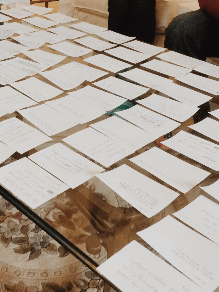
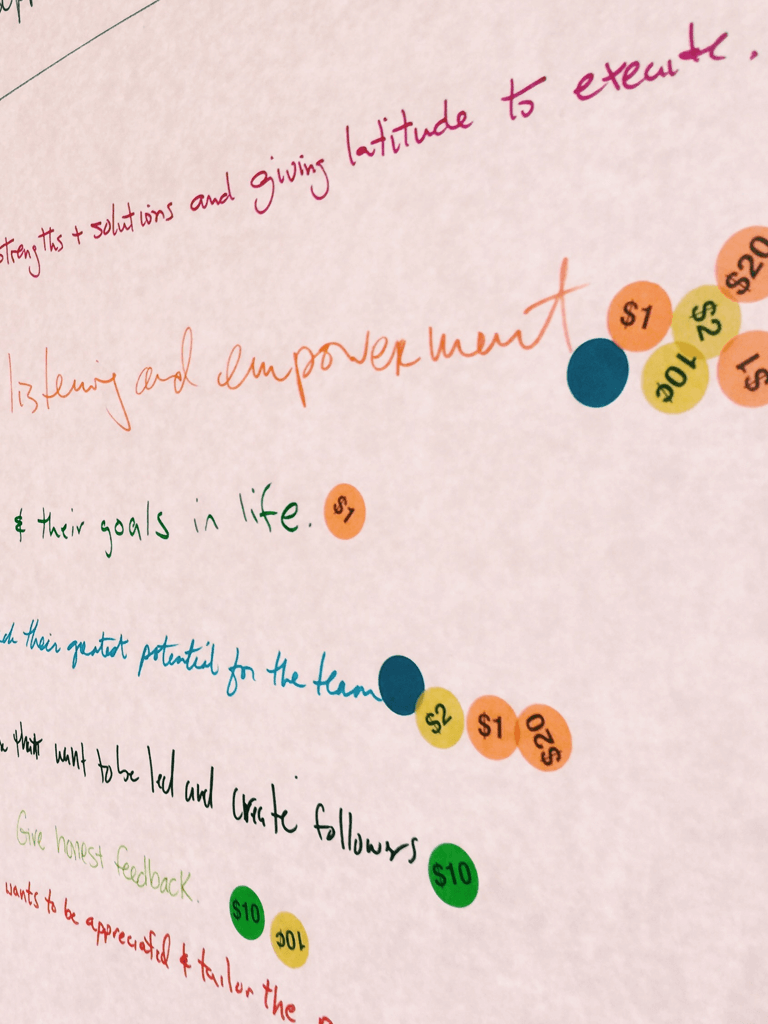
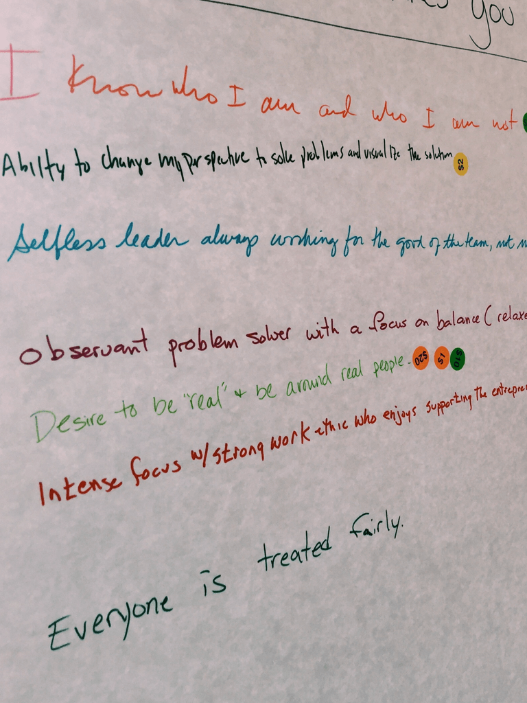
The Three-Day
Retreat
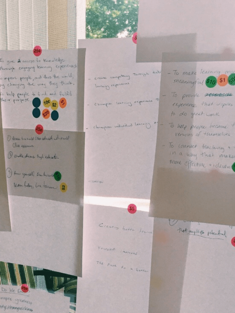
After three days of exploring everything from personal defining moments to mind mapping, word association, Crazy Eights, voting, and deep discussions, we were able to walk away with a clear mission statement and three core values that represented not only the company but also the stakeholders’ core beliefs. This was a big step in the branding exercise and really united us in a common direction. Our mission was:
To Amplify Potential
Our Core Values
Be Bold
We take action and focus on impact. We speak openly, with candor and respect. We focus on results over process. We make smart decisions and execute effectively.
Be Humble
We’re difficult to offend and quick to forgive. We work as a team. If the floor is dirty, we pick up a broom. We’re quick to admit mistakes, and are egoless when searching for the best ideas.
Be Remarkable
Going the extra mile isn’t a rarity, it’s a standard practice. We create incredible products and deliver memorable experiences.
When
We Speak
Our team created top-notch guidelines to help outline a voice for the brand. For example: Bisk speaks with the voice of a person other people admire and enjoy being around. It’s warm, frank, and honest.
Creating a Great
Brand Mark
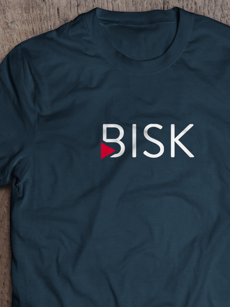
We built out a roadmap with each deliverable being categorized into a design sprint. The first sprint we embarked on revolved around the logo. Our team worked closely with the president and his father, the founder of Bisk. This allowed us to pinpoint elements that were important to the brand while discussing Bisk’s history and origin story. After card sorting with the president, we found that the new brand would revolve around three key words: bold, authentic, and imaginative.
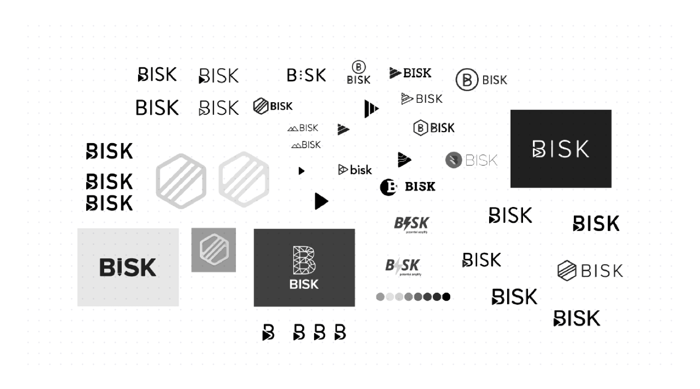
The play button is a widely recognized icon that is approachable and inviting in nature. It’s an authentic homage to Bisk’s origin of delivering content on cassette tapes. The mark is imaginative by offering a new twist on the “B,” bold through its statement and message, and authentic in its history and honesty.
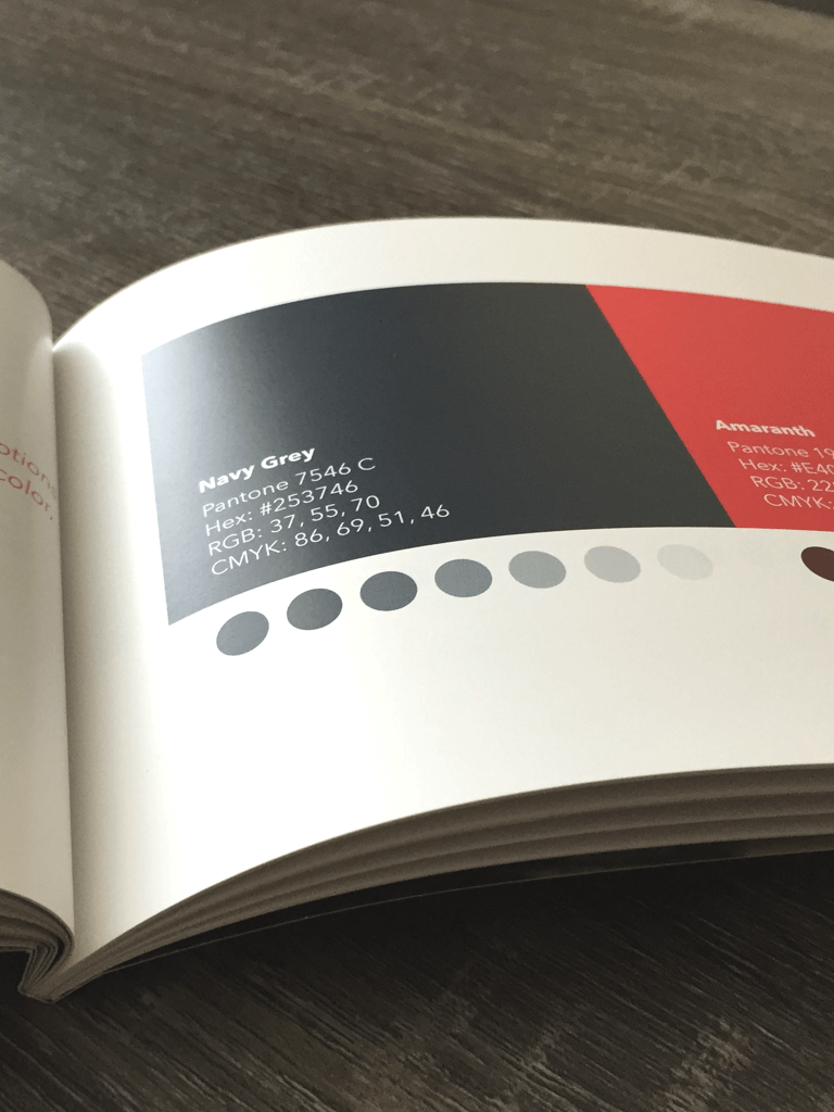
Key
Brand Colors
The colors we chose for the Bisk brand are Amaranth and Navy Grey. Amaranth is a bold, modern, and energetic color. It excites creative emotions and is balanced by the base color, Navy Grey. The combination creates a simple palette that appeals to a wide demographic, provides a bright aesthetic, and builds a creative environment for the brand.


Secondary
Brand Colors
The secondary colors were built as a supplemental palette for the brand. It consists of Cyan, Turquoise, and Blue Lavender. Cyan represents strength and dependability, Turquoise evokes emotions of growth and health, and Blue Lavender expresses innovation. The colors create a cohesive palette, offer their own unique look and feel, and allow the Bisk brand to be versatile and expansible.


Marketing
Typography
The type stack we created consists of Brandon Grotesque, Avenir Next, and Freight Text Pro. Brandon Grotesque is the same typeface that the Bisk logo was built upon, which provides consistency and a bold aesthetic for headers and titles. Avenir Next is a great pairing for lead text, subtitles, and captions. Freight Text Pro is an elegant and readable typeface for body text.


The Students
Are the Stars
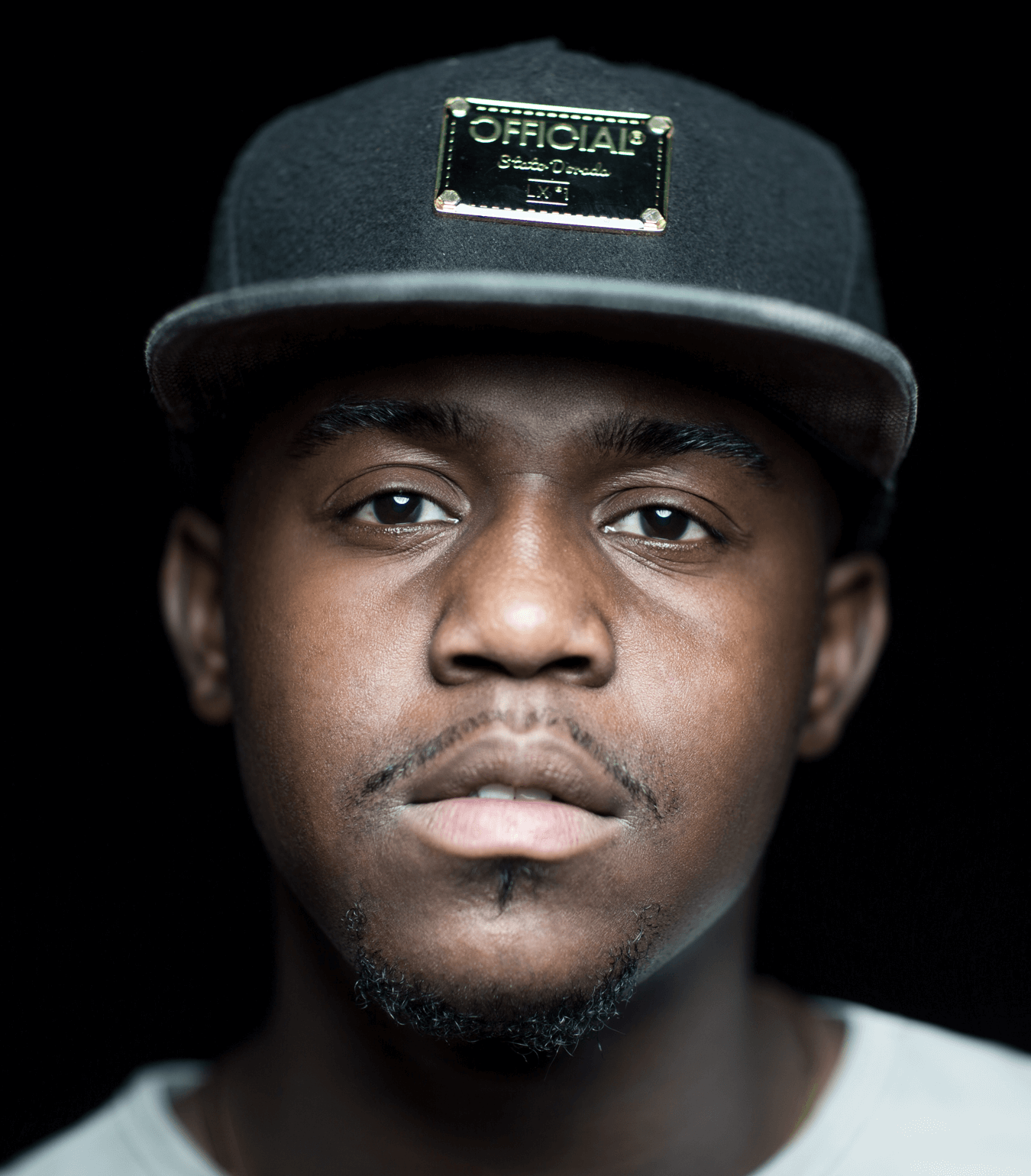
It was important for us to differentiate ourselves from our competitors while humanizing the brand and letting our personality shine through. Photography provided us with a great opportunity to do this. We worked with photographer Patrick Michael Chin to portray our students in their natural environment and in the most honest way possible. The result was stunning and had a huge impact on our marketing content.


Prepping for
the BIG Event
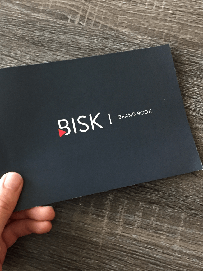
After running the sprints and finalizing the brand elements, we built out a master brand book. A t-shirt and brand book was placed on every employee’s desk the morning following the brand rollout event. Our team also created an online style guide where employees could download and access all brand assets. We also started wireframing and building the website as soon as brand elements were finalized. The website* went live on stage during the epic brand rollout event.
*The site has since been updated: http://www.bisk.com
Final
Thoughts
The brand rollout event was held at an amazing venue and had a large turnout of employees who were excited to see the new brand. It was great to see and hear their reactions to the rebrand. We even got to throw the swag off the stage to employees. I couldn’t have asked for a better branding opportunity or for a more talented team to work with.
Let’s chat
If you have any questions regarding design leadership, operations, building and scaling design systems, or fostering a culture of creativity and innovation, please don’t hesitate to reach out. I’d be happy to schedule a time for us to connect and discuss further.
Contact