Electronic Arts
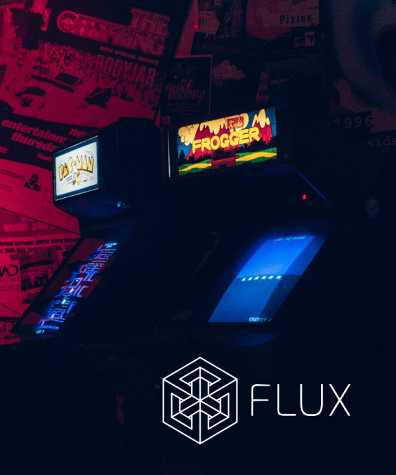
Electronic Arts needed a new way to empower its writers. The solution was Flux, a custom publishing platform.
Project Goals
To create a distributed authoring model that would allow EA’s writing staff to quickly and easily publish content across all of its platforms. We also set out to improve the experience from the player’s point of view by creating features like bookmarking, social sharing, read times, and author bios.
Improvement in Publishing Speed
Increased Number of Content Creators
Enhanced Consumer Experience
Project Strategy
My team and I needed to create an MVP. We would conduct research to understand the current pain points, then prototype new concepts and preference test solutions with the writing staff. (The output would be documentation and components.)
Strategy
Business Workshop
Brand Partnership
Technical Architecture
Experience
Journey Maps
Empathy Maps
Proto-personas
Task Analysis
Design
Style Guide
Mobile Courseware
Desktop LMS
“I just need a way to get content to players fast. It takes so long to publish content and there are a lot of opportunities we’re missing out on because of it.”Carmen Dukes
Editor in Chief

The Project
Kickoff
The editorial team was struggling to get timely content onto EA’s network of sites at scale. The tool they had been using was overly complex and not mobile-friendly. I was asked to create a tool to solve the issues facing this newly formed business unit. With limited data and a lot of unanswered questions, I set out to define a product strategy, understand the needs of the people using the tool, and conduct ideation sessions with the end users to ensure we created a tool they understood and would enjoy using on a daily basis.
What we ultimately created was a product called Flux — a flexible, mobile-friendly tool that not only solved the initial issues the team was facing but also changed the way the business unit worked as a whole. Below is a sample of the branding that was developed for the product.
Color
Study
Because the product could be used on an iPad at places like conferences or outdoor gaming events, we wanted it to have minimal colors and high contrast. We also created a simple colorsystem that would only be used for primary actions, notifications, and an illustration framework.


Typography
Choices
We decided to use Ysobel Pro for headers and accents and Harmonia Sans for body copy to meet our editorial needs. The fonts would only be used in the content creation tool. All the typography in the tool was mapped to the design system to ensure proper styling across all branded experiences.


By the
Numbers
We started our research by mining for quantitative data collected by our Digital Intelligence team. Although we were not collecting user data on internal tools, we did have a great deal of data on how players were interacting with our news content. We learned that the news content on our sites had by far the most traffic at over 3M uniques at points in campaign cycles. We also learned that we had a high bounce rate in an area of the site that should encourage higher session rates. Lastly, we discovered that people liked sharing news content, and this was a behavior we knew we wanted to encourage.
News

Home

Forums

Competitive
Assessments
Our UXR team assisted us in running competitive assessments. We created a rubric to better understand the usability by running task-based assessments with actual users. We also conducted heuristic evaluations and created feature lists. This information helped us understand how to approach creating tools and the mental models of how people relate to different features in a content creation tool. Some of the products we reviewed were Blocs, Keynote, Medium, WordPress, Google Sites, Ghost, and Squarespace.


The Journey
Map
First, I entered a discovery phase. I conducted multiple stakeholder and user interviews in order to gather a large pile of unstructured data. I was able to identify some basic themes around scheduling, instant publishing, and localization. This information, paired with a heuristic evaluation of the current tool and a competitive assessment of similar tools, gave me plenty of data that I could synthesize into useable information.
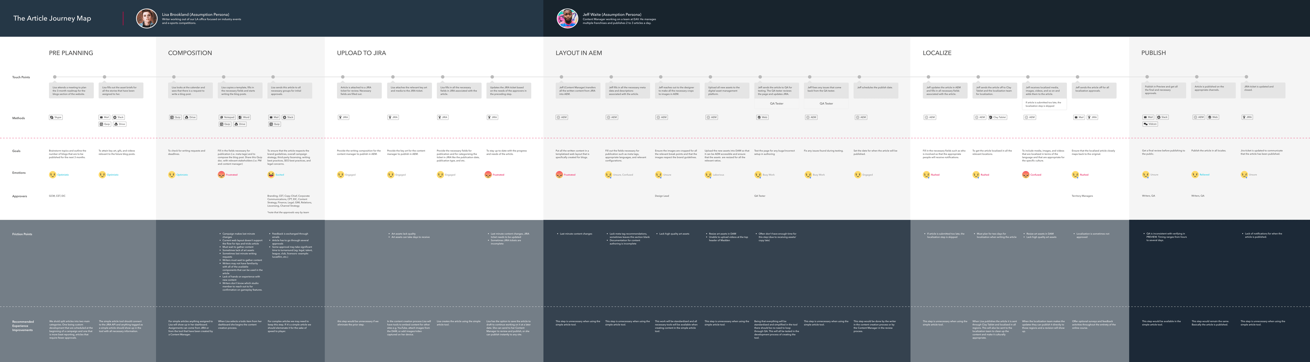
Check out the complete Journey Map.
The Right Tool
for the Right Job
After reviewing the journey and speaking with stakeholders about the business needs, we realized we needed two independent work streams. One would be for custom articles that would have custom elements and not syndicate outside of the web. The other, which would be for standard articles, would be focused on timely news that didn’t require extensive approvals and could be syndicated to the web, native apps, and console systems.
Custom Articles
These long-form pieces of content are scheduled to specific beats in a campaign. They require more approvals and are generally scheduled with the strategy team before a campaign activation.
Standard Articles
These are timely pieces that require fewer approvals. These articles can be released as breaking news and typically consist of event-based reporting.

Understanding
Needs & Limitations
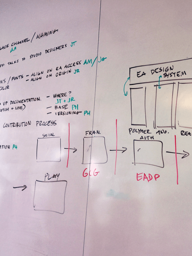
After reviewing our data we sat down with the engineering team and business stakeholders to identify what key features were needed, which content types could be distributed in our data model, and what technical limitations we were facing. We came out of this meeting with a good understanding of the technical architecture and business needs and were able to start ideating on design opportunities.
Design Ideation
& Hypothesis
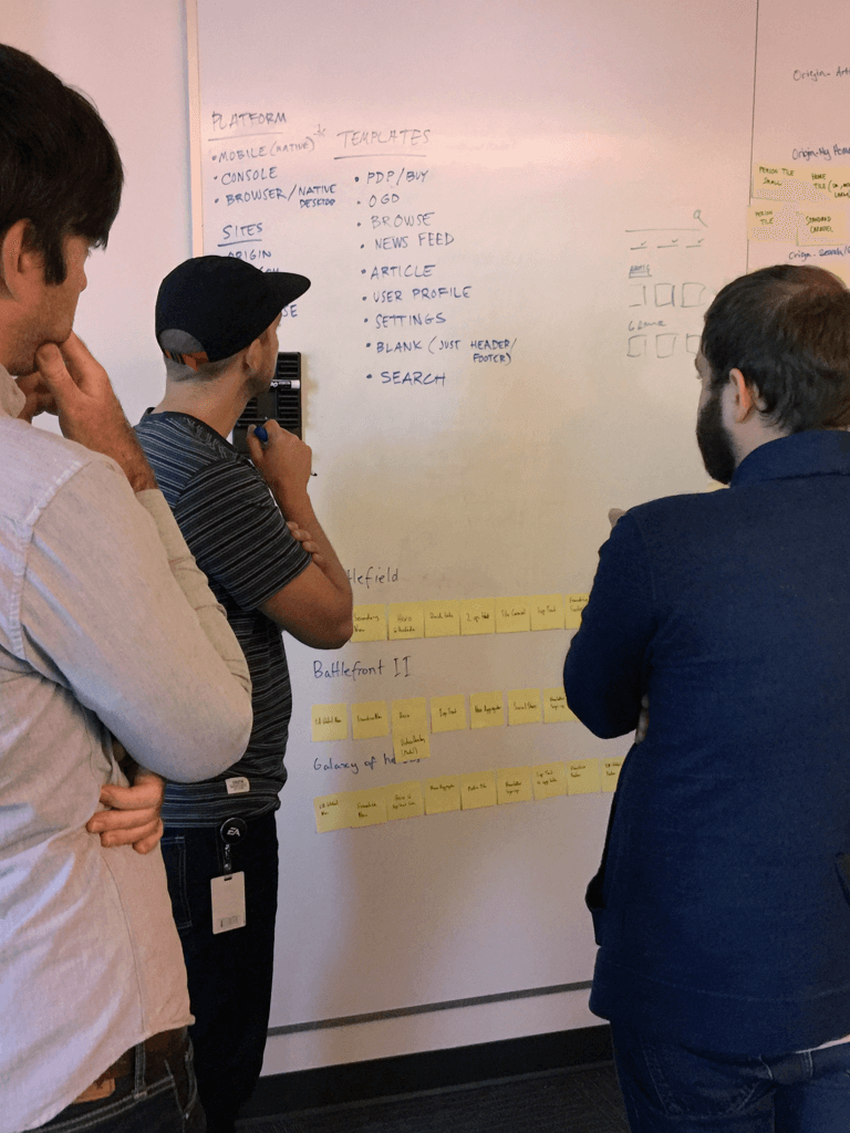
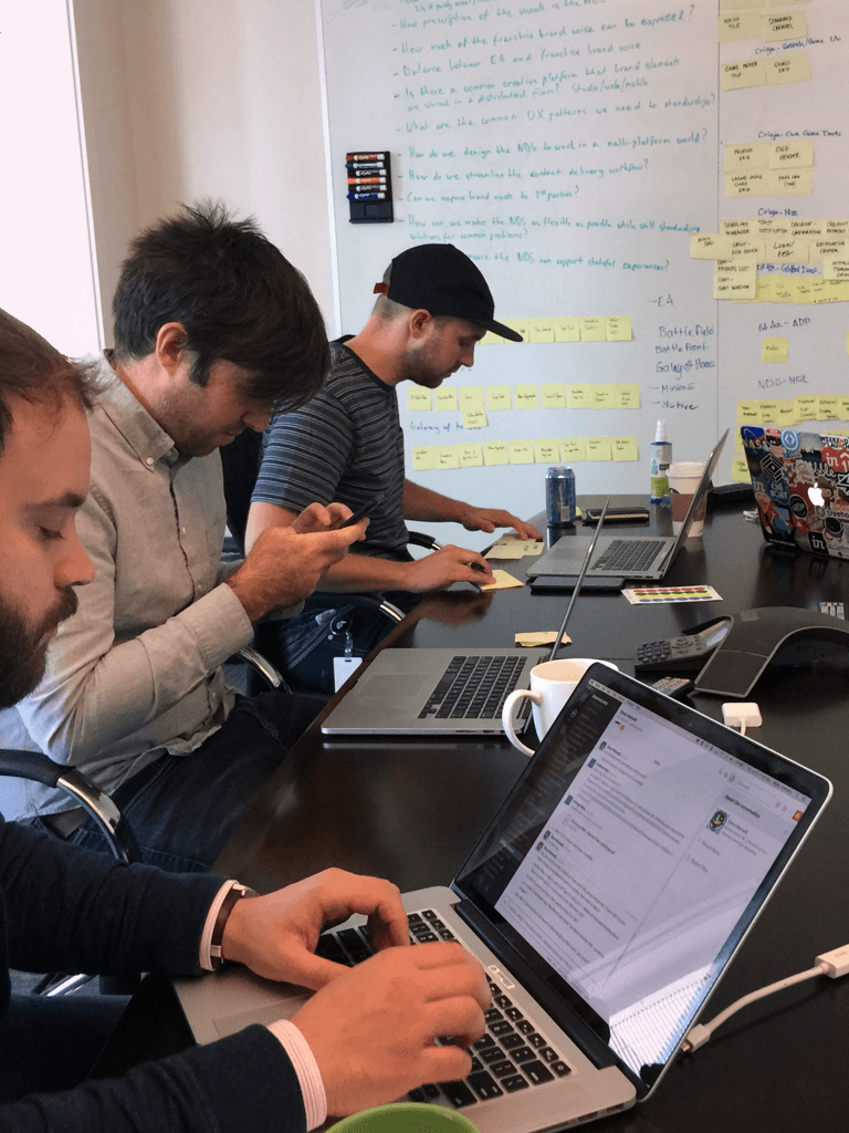
We pulled designers from various teams to ideate on designs for different features. We shared the quantitative and qualitative findings from the research sessions to ensure everyone was context set. We created user stories, ran Crazy Eights, created storyboards, and voted collectively on the ideas. We came out of this multi-day exercise with some refined ideas on features that we could prototype and start testing with the writing staff.
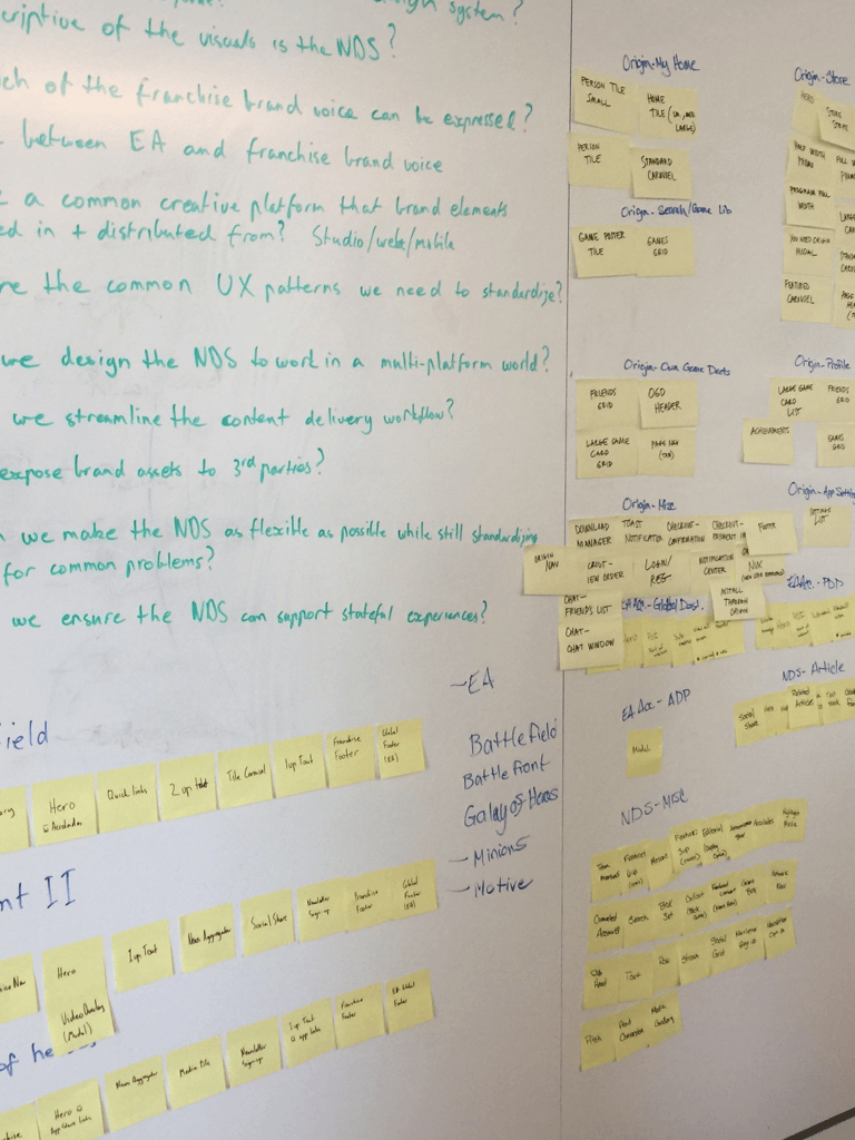
Design Concepts &
Organizing Features
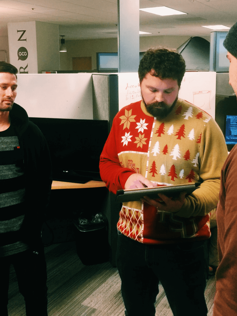
Once we had hypothesized on features and key pain points, we started sketching possible UI views and workflows to share with the writing team. We ran some CPTs (customer preference tests) to see which options made the most sense for their team. We learned a lot in this phase, and with low investment in design we were able to cycle through a lot of ideas. From here we could start to prototype and test ideas at higher fidelity.
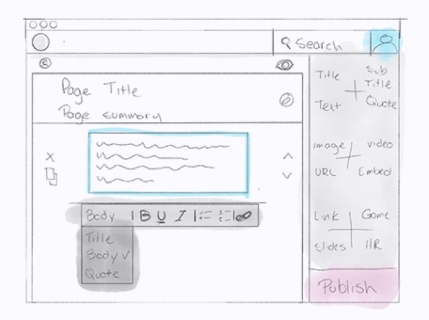
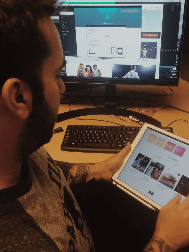
Testing & Refining
the Design
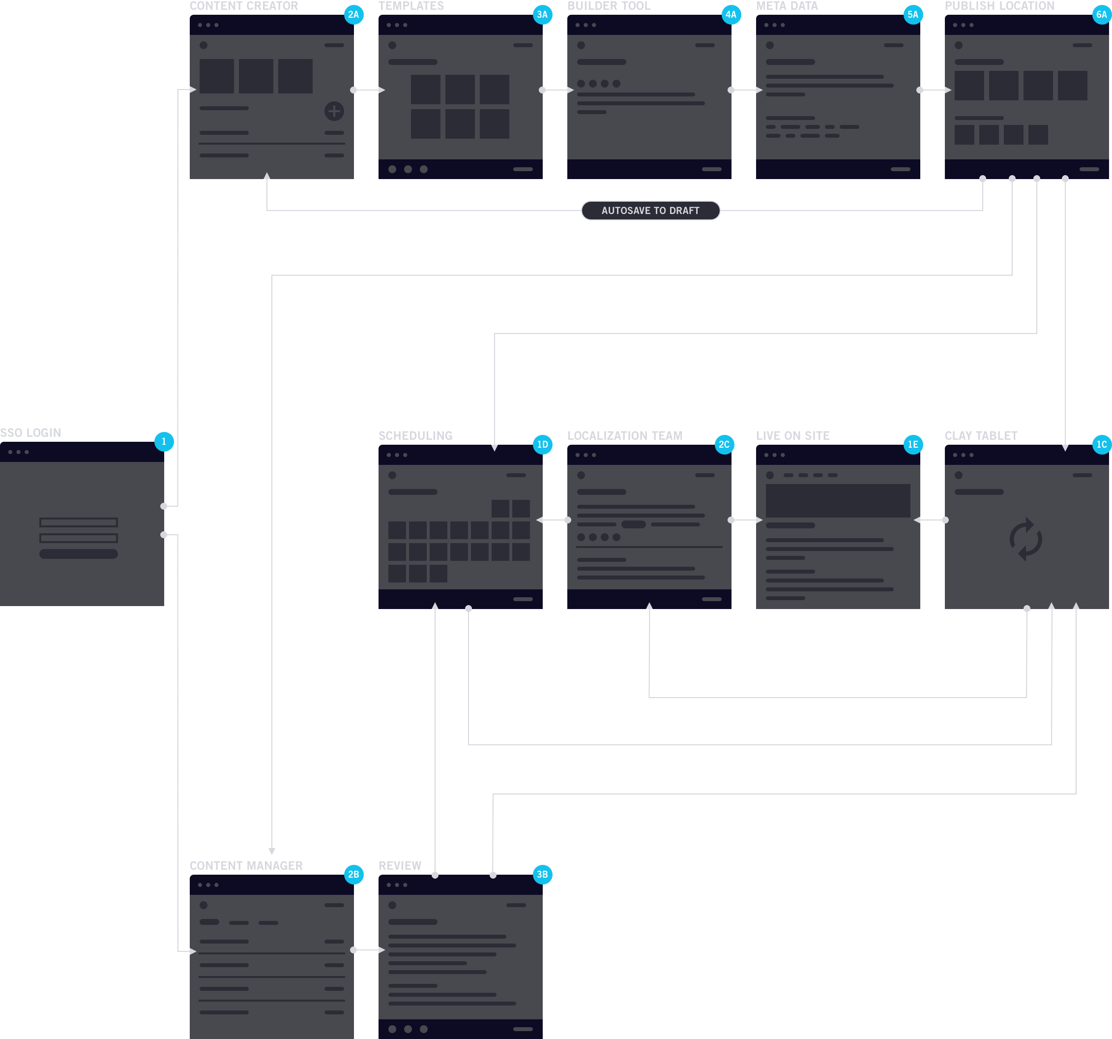
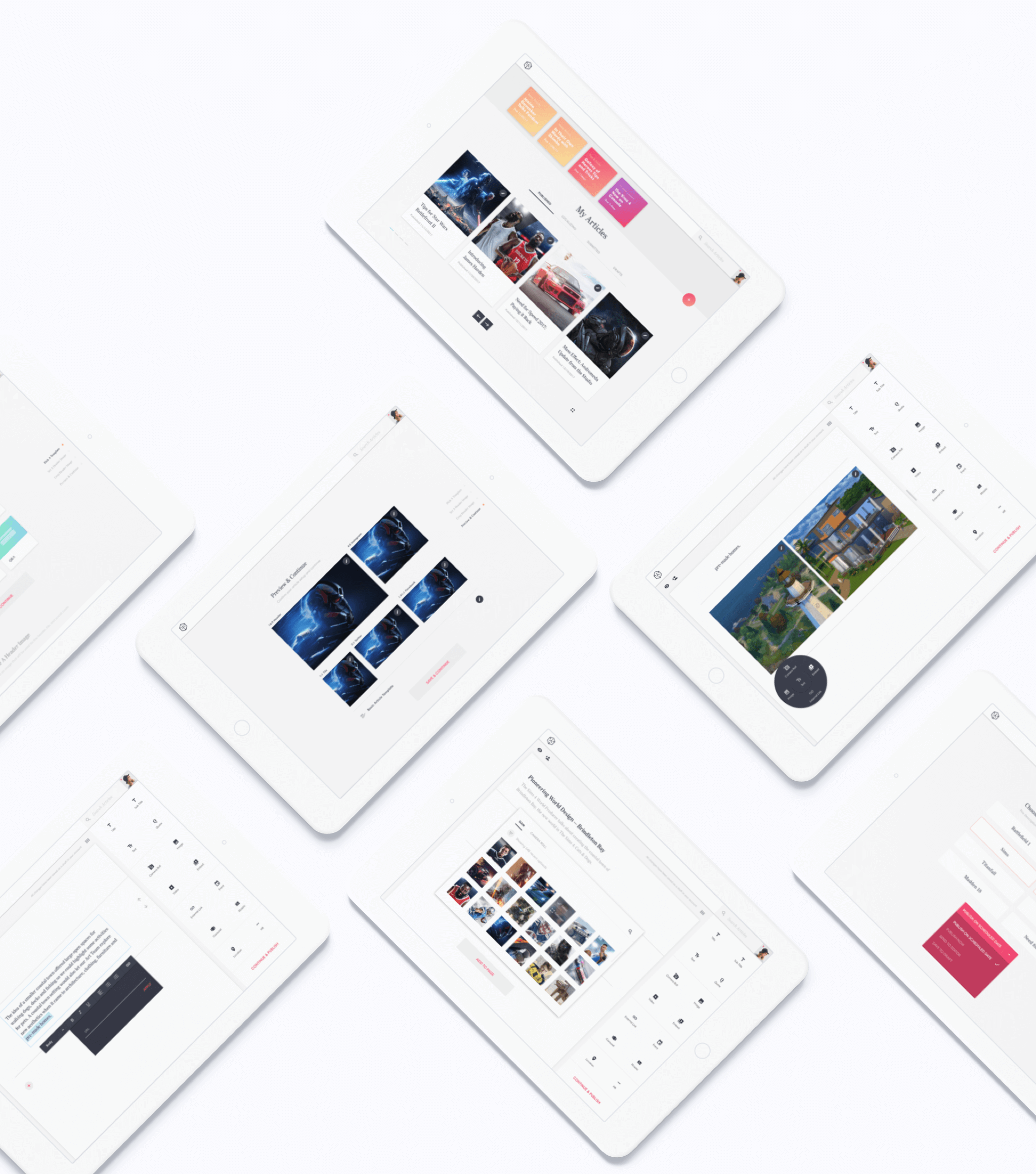
Below is one of the prototypes we created for testing. We created eight prototypes that were clustered around different user needs and features. This testing enabled us to refine to the final designs, which we ultimately shared with the developers.
Choosing the
Final Designs
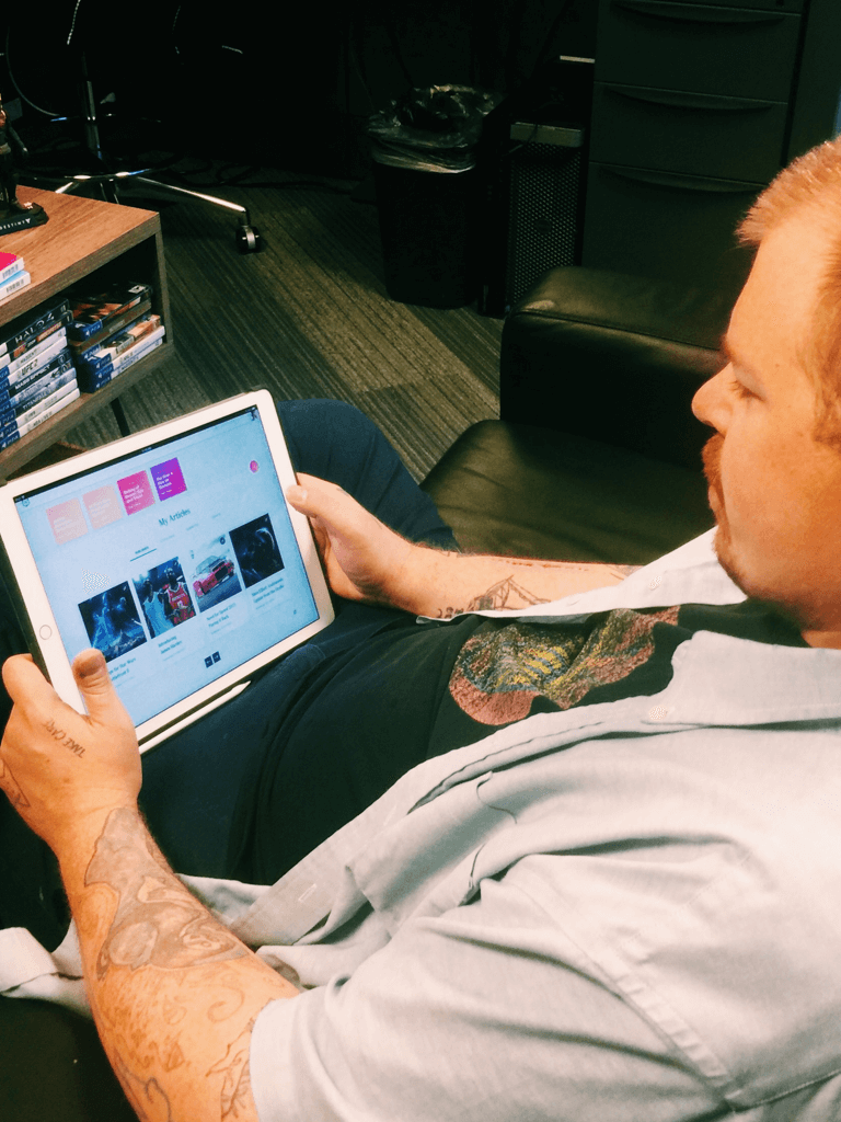
This flow was designed for writers to preference test the experience of working from an iPad, logging into their account, creating an article, adding content and media, and publishing the article. This flow made the most sense for everyone and became the design we used to guide our more complex interaction designs for the final product.
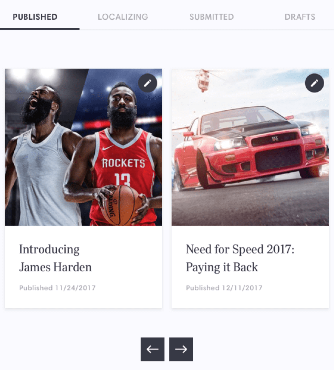
An Adaptable
Stream Component
With the limited space available on an iPad, we needed to create an easy way for writers to quickly look through their content. The organization of content needed to be stateful and prioritized in a meaningful way. Below is an example of how this component worked.
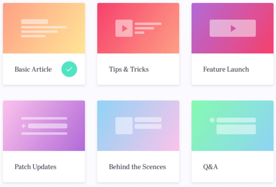
Predefined
Templates
Previously, writers spent a lot of time building content from scratch and sifting through unnecessary components. After learning more about the content they wanted to create, we were able to remove the unneeded components, add in new ones, and organize everything into templates — giving them the right tools for the right job. This cleaned up the UI and improved cognitive load.
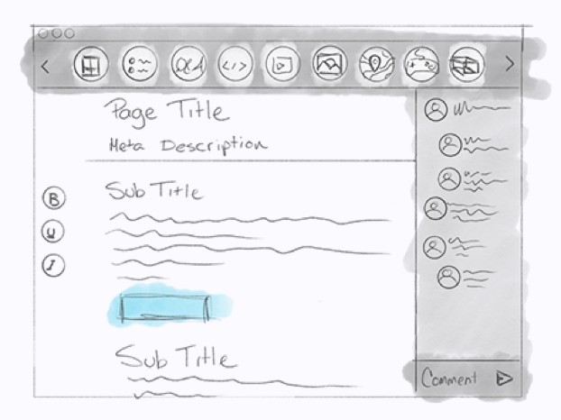
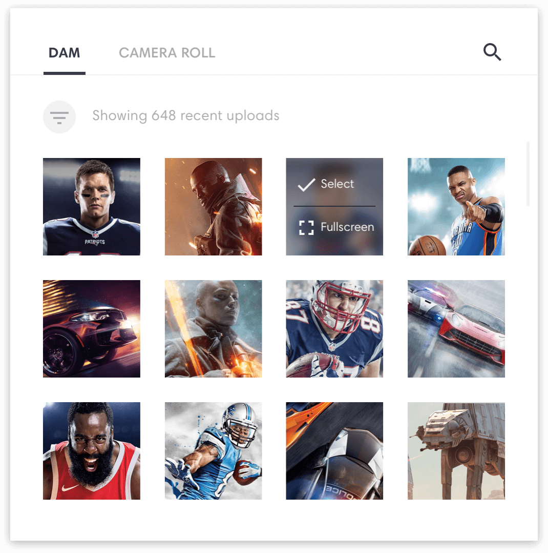
Accessing &
Saving Media
Working with media on the platform was important, but there were different workflows depending on when and where writers were applying it. We wanted to ensure accessing media was consistent across the platform so that users could develop a mental model, making complex actions feel a bit easier. We choose to use a modal and divide media into two main areas: content in our DAM and content on the user’s local device. Content added to an article from the camera roll is added to the DAM before publishing. Below is an example of previewing and selecting a piece of content from the DAM.
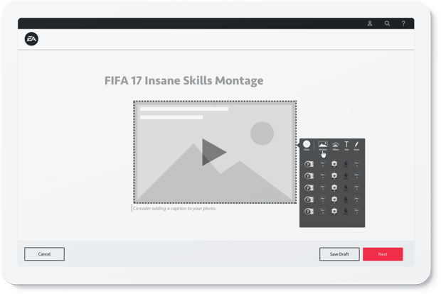
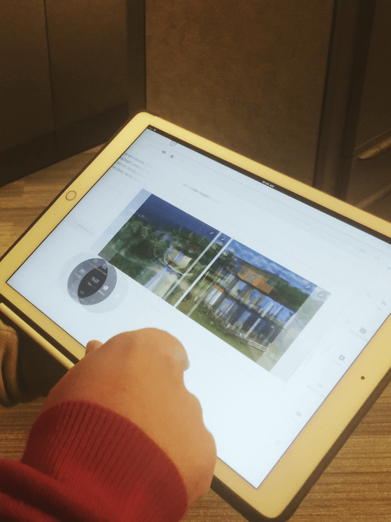
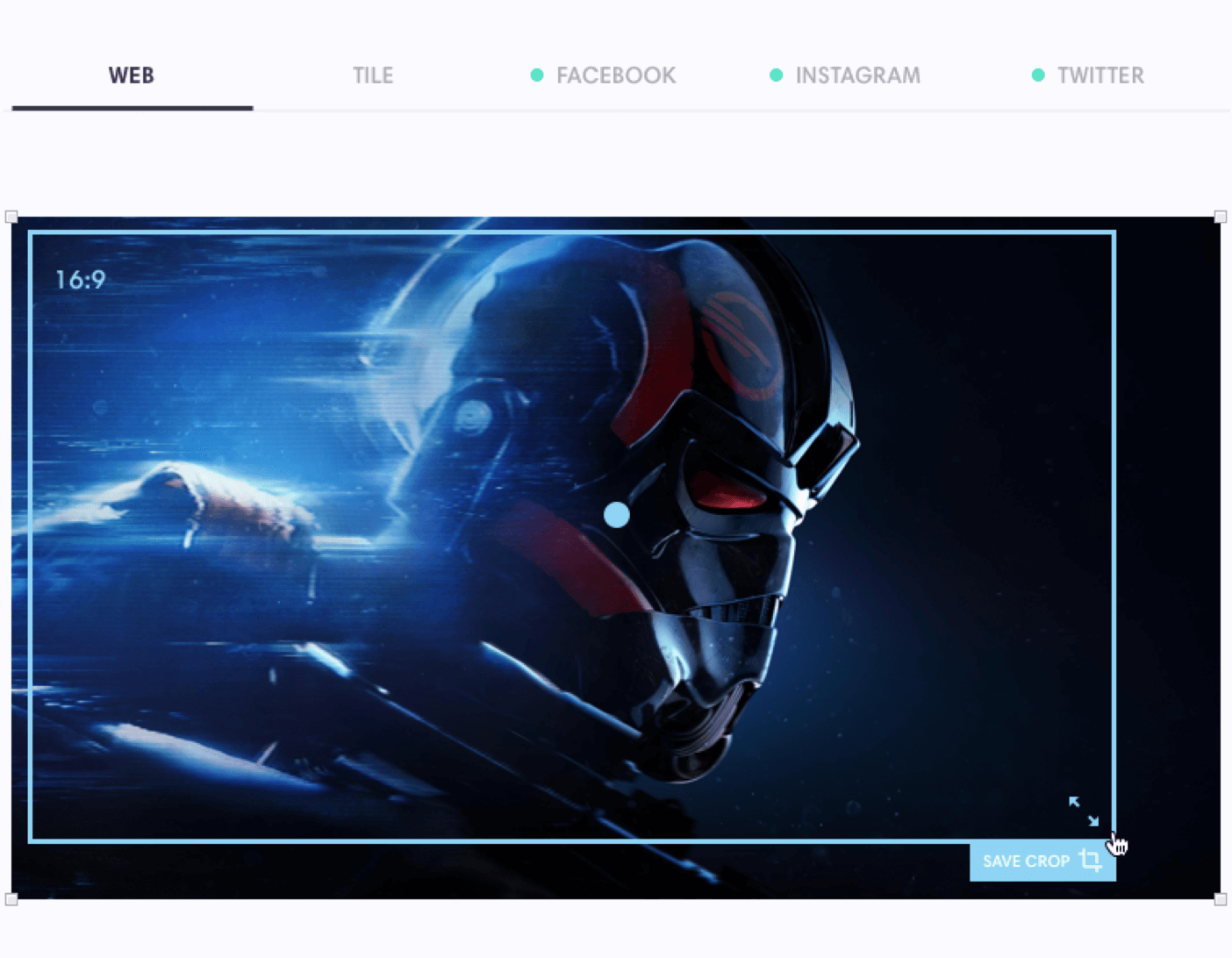
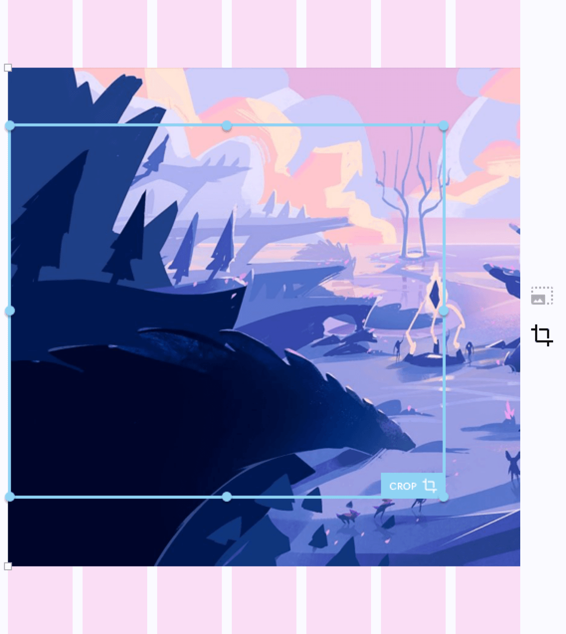
Prepping Key Art for
Marketing Content
Finding a way to easily crop images for article headers and social media posts was a fun challenge. Below is an example of the solution we landed on. Each crop is saved to its corresponding tab. The crop frame and image always maintain their aspect ratio to ensure there is no distortion or stretching of the media.
Adjusting Images
on the Fly
With Flux, there are three main options for adding images to an article: one full-width image (centered across eight columns), two side-by-side images (each spanning six columns), or three side-by-side images (each spanning four columns). When adjusting using the crop tool, images snap to the predefined widths while allowing the height to be flexible to the content creator’s discretion. If an image is added across six or fewer columns, the writer receives a cue to add additional images, which need to be added before the article can be published. Below is an example of the workflow for adding two images to an article.
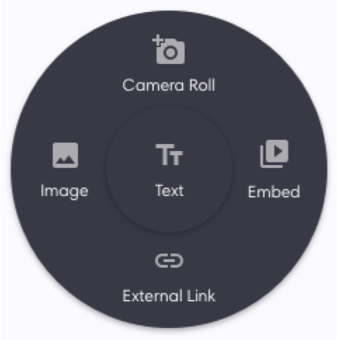
Quick Tools at
the Ready
There were some tools writers kept coming back to over and over again. We created a quick-select tool to make it a bit easier and more ergonomic to access these components.
Useful Tools
for Typography
A good type tool is essential in the content creation process. We designed ours to be as useful as possible when working on a mobile device, while also building on known and proven designs that people are accustomed to using.

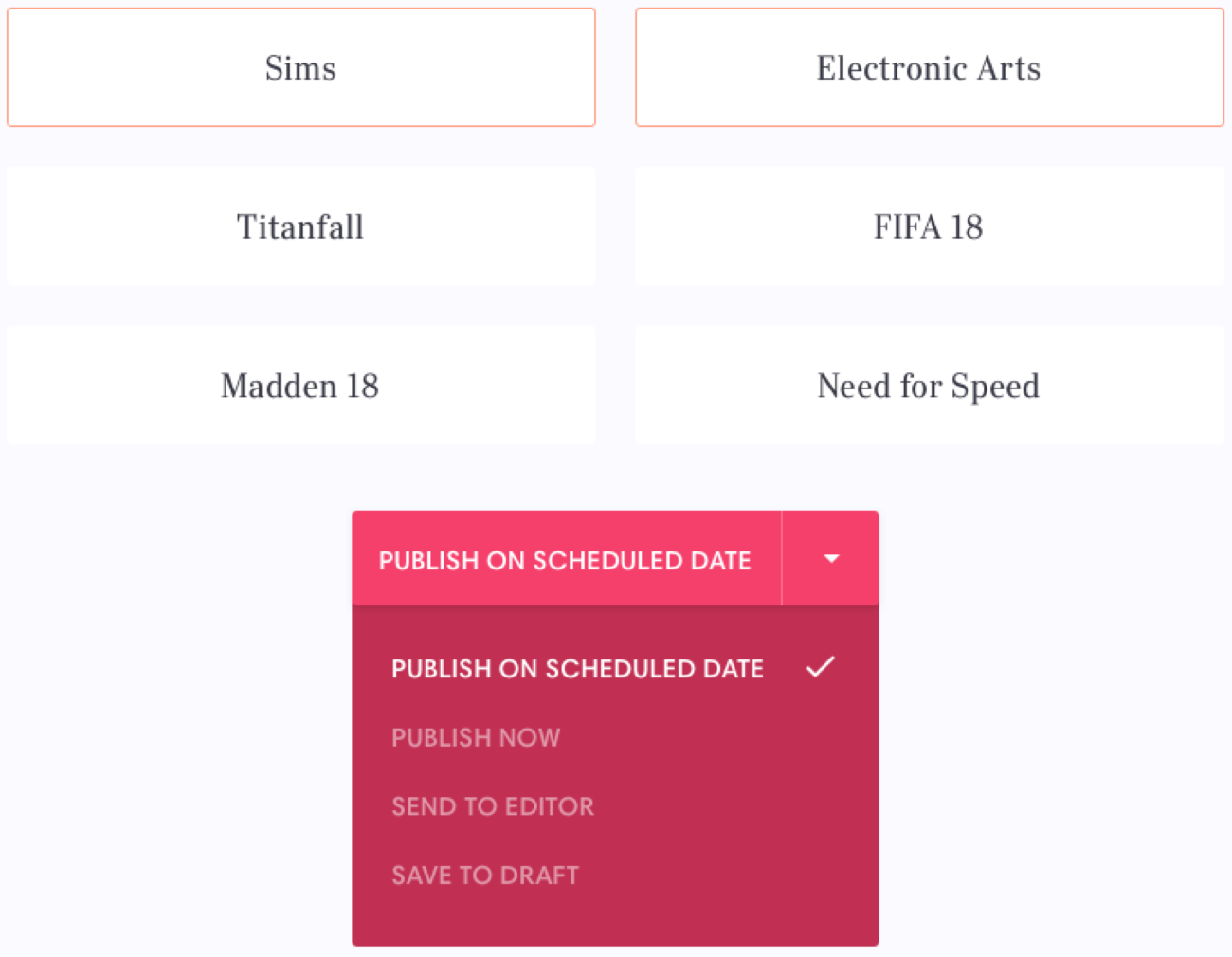
Launching the Story
at the Right Place
Content can be delivered on any of EA’s 24 sites inside its online content network. Once a piece of content is ready to be delivered, writers can add social media descriptions, meta descriptions, and meta tags for our internal search engines. Writers can also schedule or send an article to their editors as well as as pick the platforms on which to publish. Below is an example of choosing multiple publishing platforms and changing the publish time. This is the final step in the content creation process.
Final
Thoughts
Working on this project was a great opportunity. Having the chance to solve problems for people and make their day-to-day lives a little better is why I do this kind of work. Working with the talented staff at EA was an amazing experience. I walked away from the project knowing I made a real difference, and also picked up some new skills to take with me to my next project.
Let’s chat
If you have any questions regarding design leadership, operations, building and scaling design systems, or fostering a culture of creativity and innovation, please don’t hesitate to reach out. I’d be happy to schedule a time for us to connect and discuss further.
Contact